By Michael W. Harris

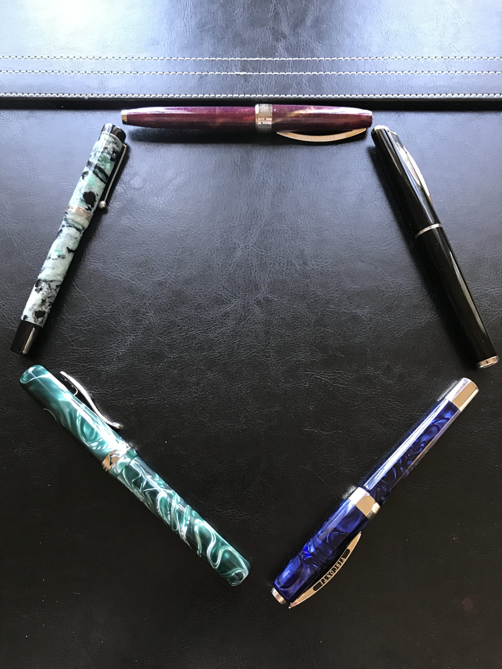
It was never my intention to end up with four Visconti pens (not counting my TWScontis) all with different nib materials, but so it was that a could not pass-up deal on a Pininfarina with the so-called “Chromium 18” nib (whose exact metallurgical composition and how it differs from plain steel I shall not litigate here) found me in possession of steel, chromium 18, 18K gold, and 23K palladium nibbed pens. The loan of an Opera with a 14K gold nib completed the set of Visconti nib materials (not counting the seemingly Delta inspired “fusion” nib) meant that the Italian Standoff was on.
The results? Well, first off, I must have the best nib luck because none of the Viscontis I have owned, borrowed, or sold have ever been problematic. The Green Marbled Opera that I bought and sold had a 14K gold nib that was a bit picky about inks but it was still lovely most of the time. Interestingly, I think it might be something about the 14K nibs Visconti had because both that one and the blue Opera I borrowed for this shootout had similar issues with occasional skipping. I will get to that eventually, but let’s get this shootout going. I’ll start by giving my semi-quick thoughts on each before rankings the nibs in order of preference.
* * *
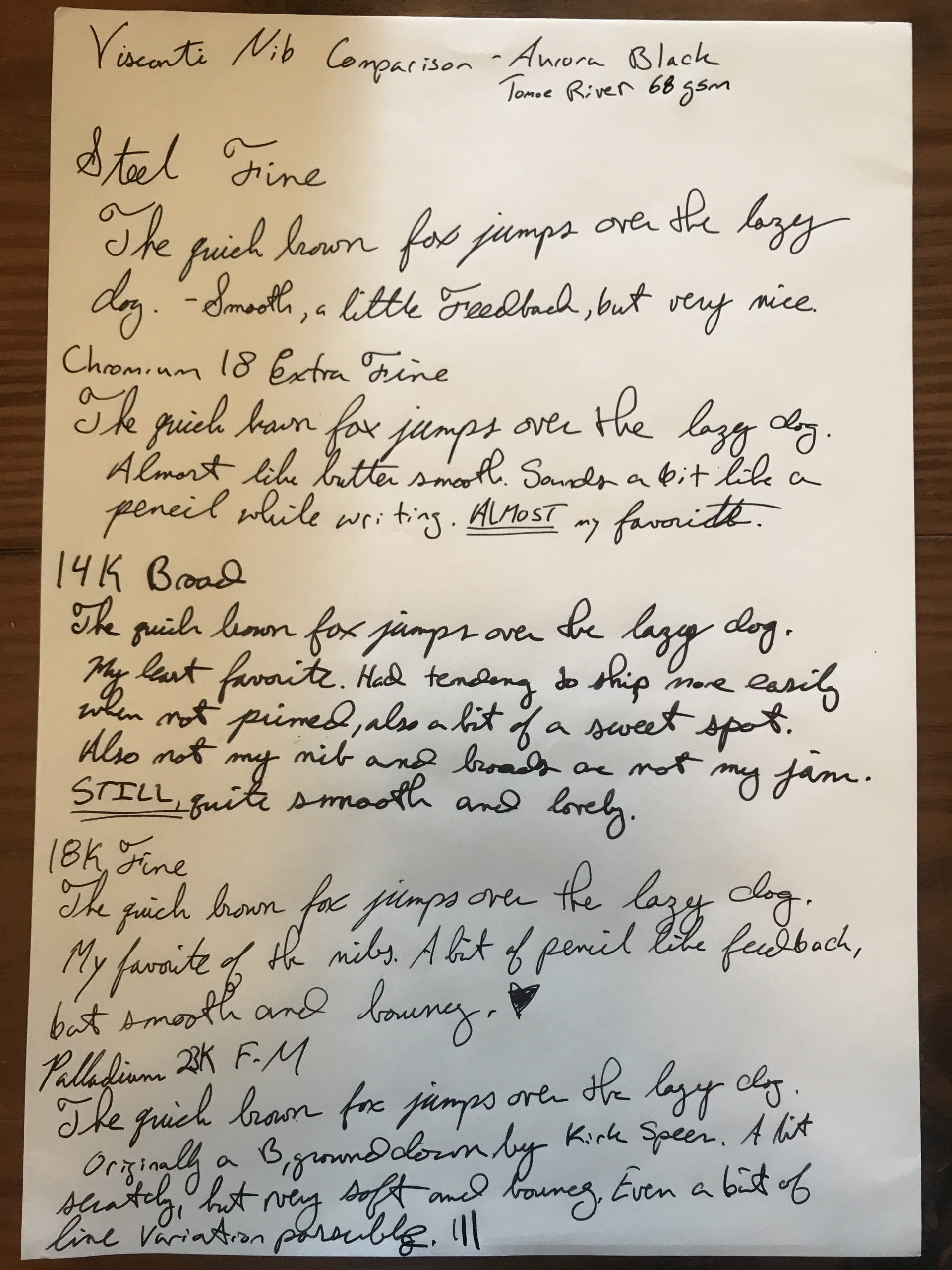
Hall of Music, Burgundy (Jazz) – Steel, Fine

My first Visconti, and one that I had traded away but eventually bought back because it was just that good as a daily pen. The steel nib on it is a very pleasant writer: generally smooth, with just a hint of feedback. A thoroughly enjoyable writer, but nothing truly special either. Not a first or a second round pick in the draft, but a solid mid-round pick-up that will serve you well over the years. In general, if you can grab an older Visconti with a steel nib in the sub $100 range, do it.
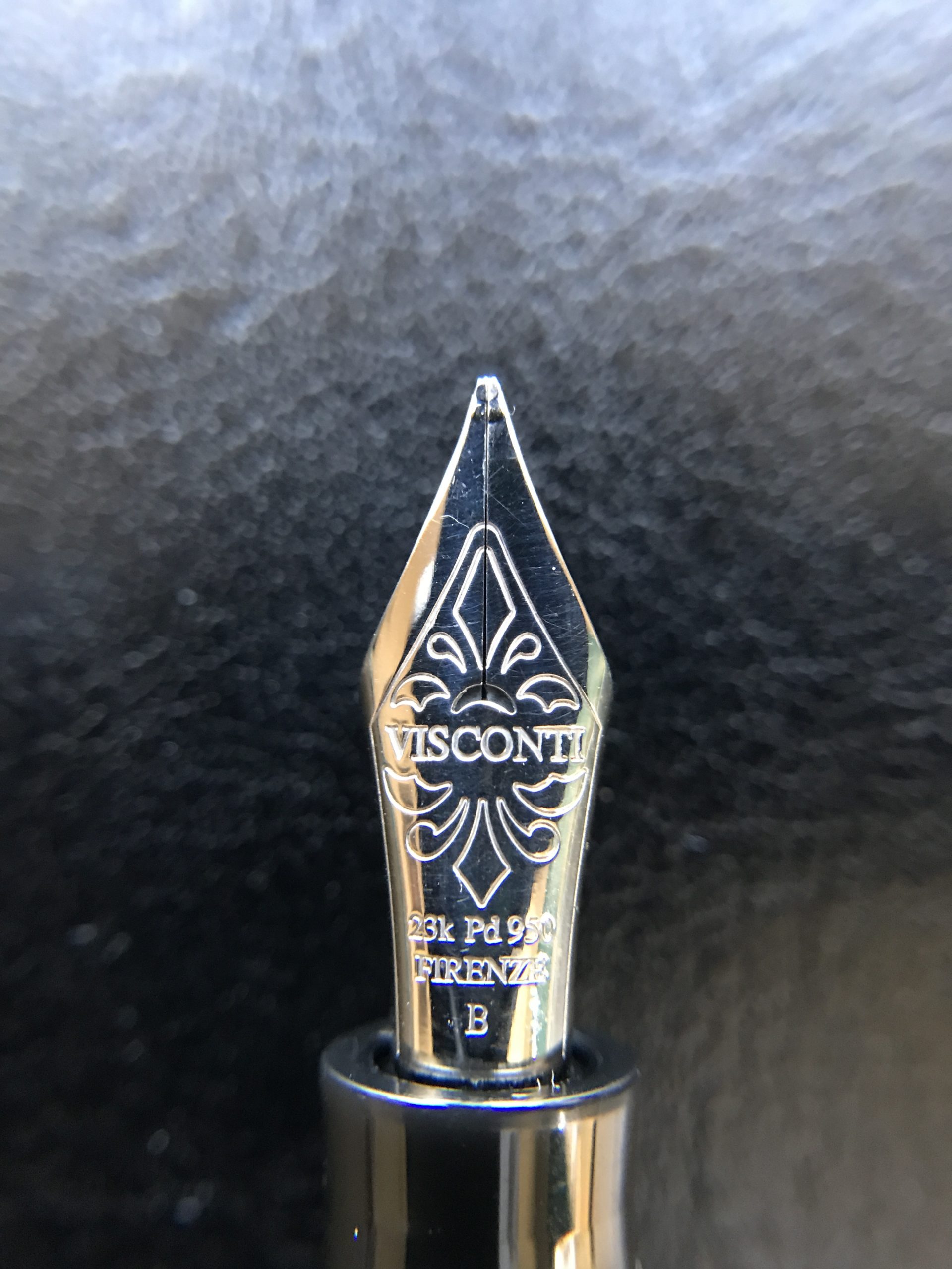
Pininfarina, Black – Chromium 18, Extra Fine
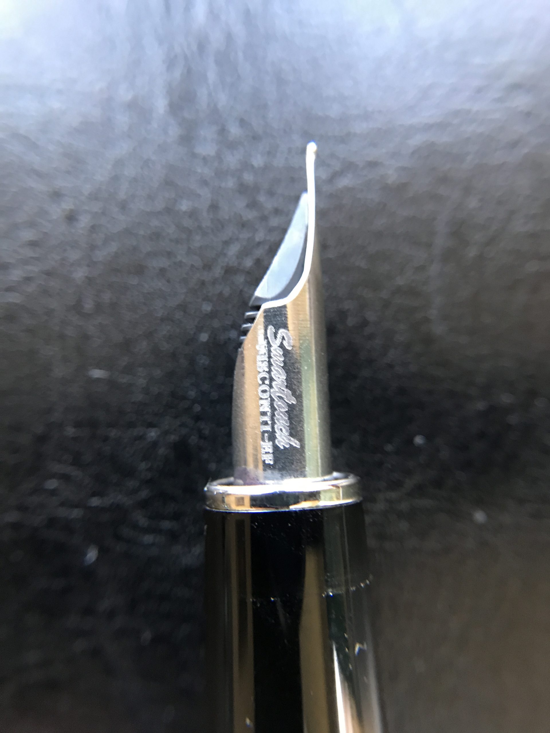
This was truly the surprise of the bunch. From the first time I put nib to page, it immediately became one of my favorite EF pens (alongside TWSBI EFs), which I generally find to be too toothy for my taste. But this nib is butter smooth with a pleasant pencil-like sound on the page. It is bouncy, expressive, and just a lovely writing nib. While basic black pens are not my jam, this pen is going to stick around in my collection for sure.
Opera, Blue Marbled – 14K Gold, Broad
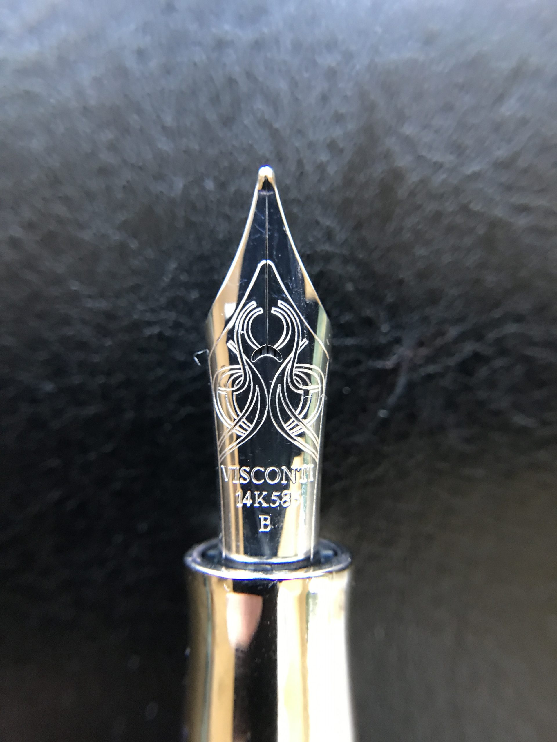
This was a tough pen to judge. First, it is not mine. Second, I generally do not like writing with broad nibs. Also, I have my previous experience with an Opera 14K nib in my brain that may have colored my experience. However, it is because of that experience that I tested all the nibs in this shootout with Aurora Black, the ink that had worked the best in that previous pen.
So, while a mostly smooth and lovely nib, it also had a tendency to skip if the converter was not kept primed. There also seemed to be a bit of a sweet spot. However, it was a good nib, but the competition in this shootout was something fierce.
Kaleido Voyager, Forest Green – 18K Gold, Fine
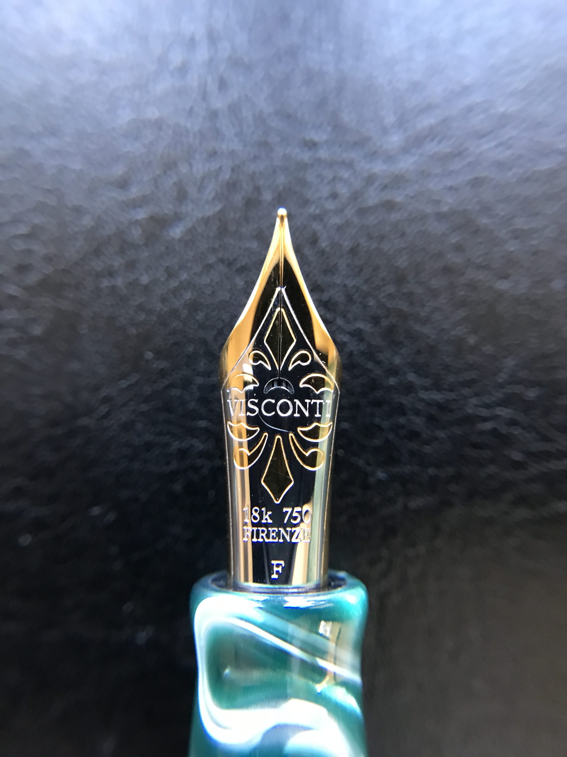
This nib is sublime. Bouncy, juicy, and a wonderfully fine line. There is just the barest hint of feedback that is quite pleasant and it is otherwise smooth as glass. From the second I ink it up, I was in love. I will go ahead and spoil the ending: this nib is the clear winner. I was fairly sure going in that that would be the result, a belief that was only confirmed in this review.
Ponte Vecchio, Silver Granite – 23K Palladium, Fine-Medium
 Full disclosure: this is not this pen’s original nib. Visconti did not even use palladium nibs when the model was in production in the mid-90s. Originally I received this pen in a trade (which ironically included the Hall of Music above, along with a Sailor and a Montegrappa) and it came with a two-tone steel nib whose gold plating was coming off. This is a lovely celluloid pen and it deserved better, so I bought a small palladium nib unit from nibs.com (not longer available), that was only available in broad, and had Kirk Speer mount the nib and grind the broad down to a fine-medium.
The nib has just a bit feedback and I still need to do a bit of adjusting on it to my taste, but the bottom line is that it is juicy, with some nice bounce, and will even give you a bit of line variation (see the image below). It is a fun and expressive nib, and truly worthy of the gorgeous pen that it is in!
* * *
Just to let you behind the curtain of my testing process: I used all of these pens over the course of two weeks with Aurora Black in everyday writing situations. I used them with a wide variety of paper including Rhodia, Clairefontaine, copy paper, and my Montblanc journal (my current daily pages). While it was not the most scientific method, it did give me time to consider my thoughts, and all of them were used at least once, if not twice, for journal entries.
I have already spoiled the winner, but here are my personal rankings of Visconti nib materials based on what I tested:
- 18K Gold
- Chromium 18
- 23K Palladium
- Steel
- 14K Gold
I should add, however, that even though the 14K was last, it is still better than a lot of nibs. With these rankings, it is mostly that I found the 14K just a bit more problematic with occasional skipping which drove it below the others. In reality, the distance between 3 and 5 is quite small, and it is really only the 18K and the Chromium that were truly a cut above the rest.
So, that is it, my first and probably last shootout. Not many manufactures use or have used so many different nib materials, so I do not foresee the opportunity to do it again.
But never say never…